I began by looking at the The AGO ‘s website to get a better understanding of their style. I reviewed a history of Frank Gehry’s work so I could familiarize myself with his unique (and surprisingly playful) creativity. I designed two mood boards with two individual themes. From there, I looked at various type options and colour palettes that were consistent with the style of both the venue and the artist who’s name the restaurant was named after.
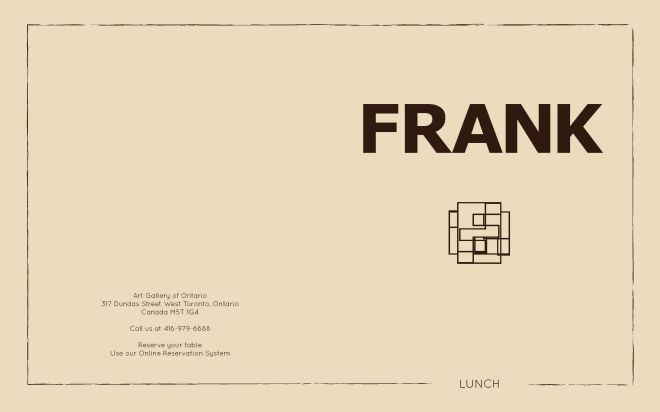
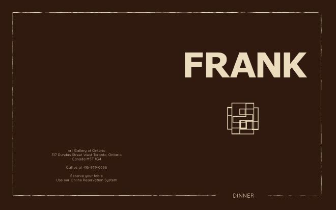
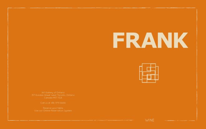
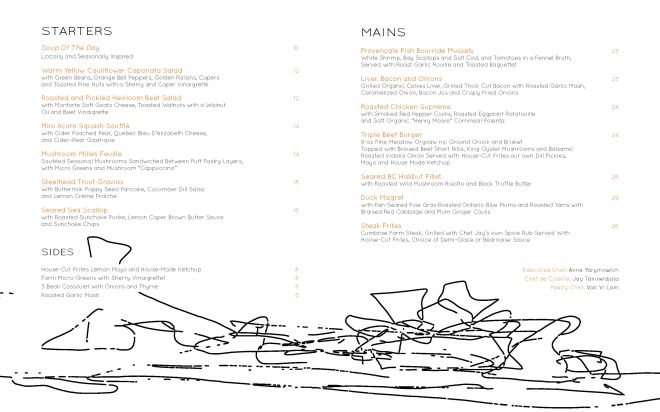
The colours were inspired by the museums incredible use of wood, the font was chosen to be simple and minimally distracting. I wanted the menu to be a reflection of both The AGO and Frank Gehry. Some of the challenges I found with this project came when trying to decide how to incorporate the artists unconventional style into a menu filled with text. In the end, I think thoughtful placement and simplicity allow the two elements to work well together. The cover was meant to pay tribute to Frank, so I wanted his name to be the forefront. Everything else was just a compliment. I really enjoy the cubic “F” design I created in Illustrator, which plays homage to both the visual and the architectural components of the museum.
Check out my menu re-design for Frank at the AGO.