Check out my new site, it has a new look. marekszkudlarek.com
Photoshop & Photography
A collection of photographic inspirations, ideas and references.
Final Portfolio Presentation
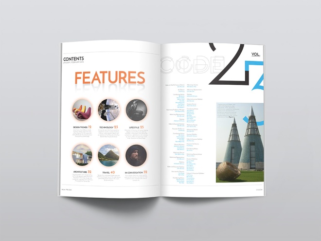
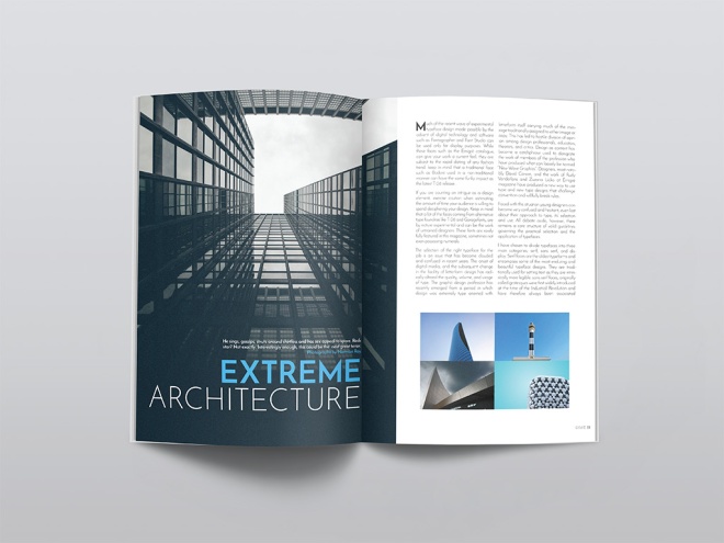
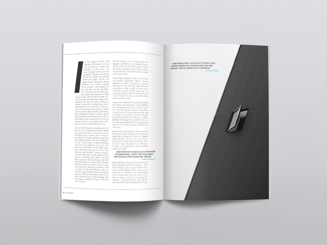
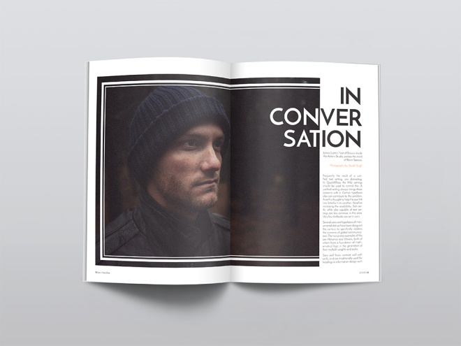
Magazine Print Layout
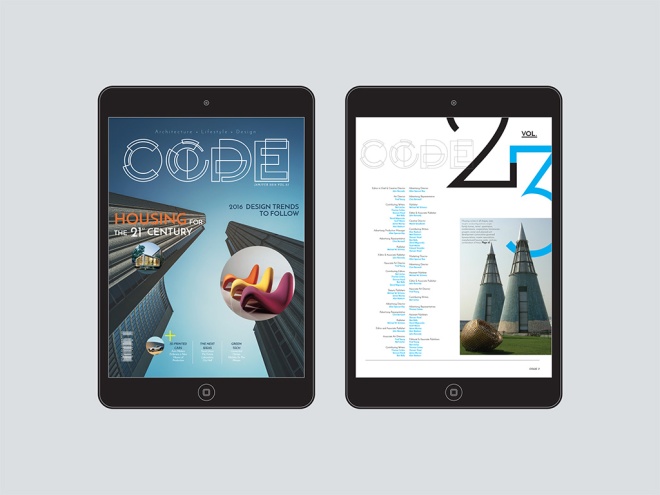
We were to create, name and design a magazine that fits into an existing category: fashion, music, design, men’s style, architecture, food, etc. I started by creating a fun creative logo for the magazine, then I experimented with different typography choices to find the most suitable typeface for my audience. Stock images were sourced that offer an architectual feel to the magazine, which also helped to design each page layout. The light use of colour played a role as well, using complimentary colours throughout the magazine. Page elements, styles, pull quotes and folios were also used in Indesign to achieve the overall design of my architecture magazine.
COMPOSITE #2: CD RELEASE & WEBSITE

PROJECT SUMMARY
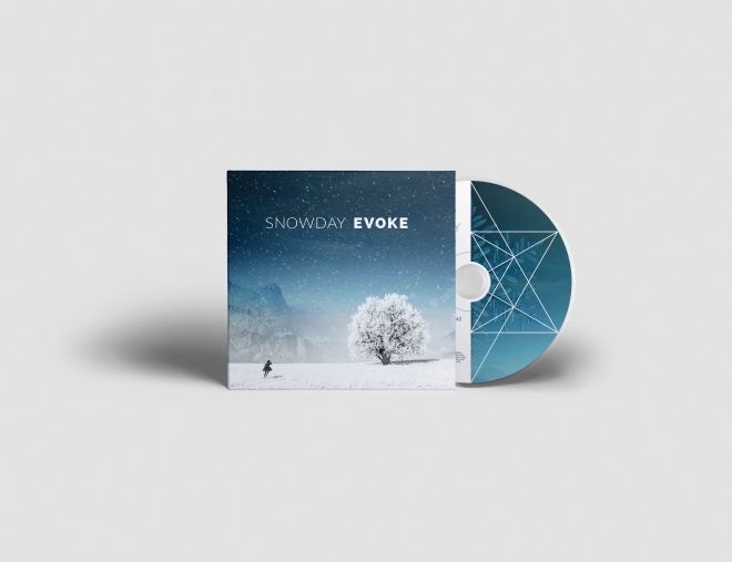
The band I chose for my CD project is Snowday, a chill-out electronic duo from Toronto, Canada. Cam Sloan and Chad Skinner went back to the basics, jamming with small acoustic instruments they collected throughout their travels in Europe. Their newfound appreciation for acoustic textures coloured the material they recorded upon their return home. This sound became Snowday’s first songs. Fans are both male and female, in the early 20’s to late 30’s age group. It is not uncommon to hear their music in a lounge setting while enjoying an exceptional beverage in a swank hotel bar.
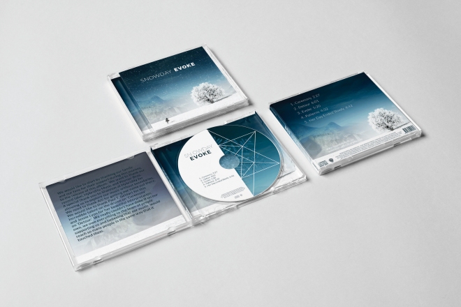
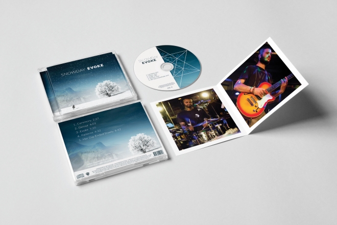
The two friends met in high school and have made music together in various projects and bonded over a mutual love of underground hip-hop from their home town of Ottawa. Later inspired by the records they were sampling and with a desire to become better performers, they taught themselves to play their own instruments. Everything from piano, guitar and more wordly, less common instruments paved the foundation for Snowday’s live organic approach to ambient pop.Cam and Chad are only just beginning to develop their branding identity, so it was a great opportunity to produce the album artwork and overall style of the printed media. I decided on a ‘single-page’ scroll layout for the website, with a fixed navigation menu at the top, which linked to each section of the page: Home, Bio, Tour, Media, and Contact – with links to social media including Twitter, Facebook, Instagram, YouTube and Sound Cloud. The images were sourced from the bands online site, however, stock images were used for the header and the CD package design. All written text was sourced from the band, although details such as tour dates were fabricated in order to reflect the unconfirmed future performances.
Their upcoming debut album, Evoke is a chill-out, feel good, sensual as it is psychedelic. Swirling synths and laid back guitars swim in washes of liquid reverb and sparkling delays, all gently propelled by an understated and pulsing rhythm. The majority of the album is instrumental and meditative, broken up by ethereal violin sounds by Jessie Lyon and heart-racing drum performance by Paul T. Geldart.The design of both CD and website incorporates many functional elements such as live media links to audio/video and an image gallery. The colour palette and the consistency
of it’s use played a big role in tying all the pieces together. The website keeps fans up-to-date on upcoming shows and performances in the Tour section. Fans are able to explore the band and their music on a more personal and intuitive level, allowing them to take away an appreciation for the style rather than be told how to enjoy the experience.
Have a look at my final CD mock ups.
Protected: Composite #2 Proposal
Nuit Blanche

Our final assignment in Typography class was to create a poster for one of three categories, Nuit Blanche, WordCamp or Fringe Festival. I decided to create a poster for Nuit Blanche. I wanted to create something that would stop someone in their tracks and have a long look at the poster. Here’s my break down of the poster. I hope you enjoy!
Target
My target audience for this poster are both male and female age 25 and up. Although this event is open to everyone, I feel it attracts to young professionals. People of all kinds flock to this event to get inspired and explore the wonders created by artists from around the globe. I think that this poster stands out to the target audience because the punch of color used is striking to the eye. The graphics encourage the audience to expand their minds into their personal creative wonderland.
Design
I wanted to create something that not only opens the mind of the viewer but allows them to think creatively before attending the event. I found a silhouette of a dear and dropped a hi res file of nebula onto it and blended the two to create a spacey looking creation of a dear lost in the dark woods; much like the audience will feel wandering the streets surrounded by skyscrapers. With the use of the original Nuit Blanche logo design, I removed the font, kept the swirl and also dropped another image onto it to make it look like a web of explosive imagination was going on in the mind of the dear. The colorful flying origami birds add to the poster because it looks as if they were the ones responsible for the tangled swirl above the dear. The font used was Permanent Marker which I think was a great choice because it reads well, looks good for a bold title and with minimal text on the poster. Supporting sponsors are included at the bottom with their respective logos.
Hierarchy
I wanted to emphasize the most important element of the poster: the what and where. Anyone who catch- es a glimpse of the poster will immediately understand it’s for Nuit Blanche. The exhibits at Nuit Blanche cover a huge range of disciplines and I wanted to use the infinite depth of the universe to convey this. Dear are known to be both magical and spiritual creatures so I think it’s fitting to have this dear silhouetted while supporting the recognizable Nuit Blanche swirl design. The dear is flanked by modern origami birds that also represent the intricacies of exhibits at the show, both large and small. The bottom of the poster includes the website (for more information) and sponsors in a clear and flattering way. As the viewer will most likely only see the poster for a brief moment, I believe that they will easily understand and remember the most important details and be left with a sense of intrigue and excitement at the possibilities waiting for them.
