Check out my new site, it has a new look. marekszkudlarek.com
Type
Final Portfolio Presentation
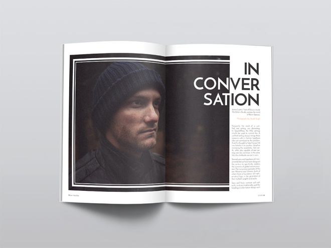
Magazine Print Layout
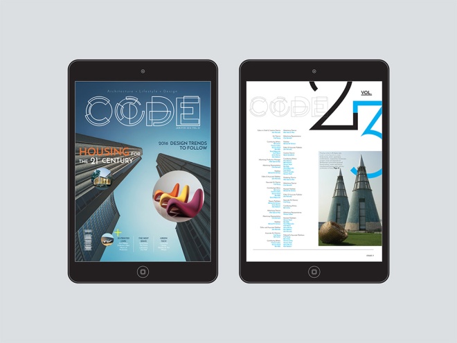
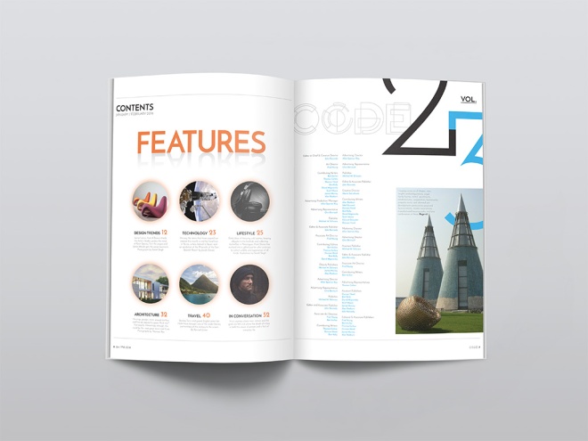
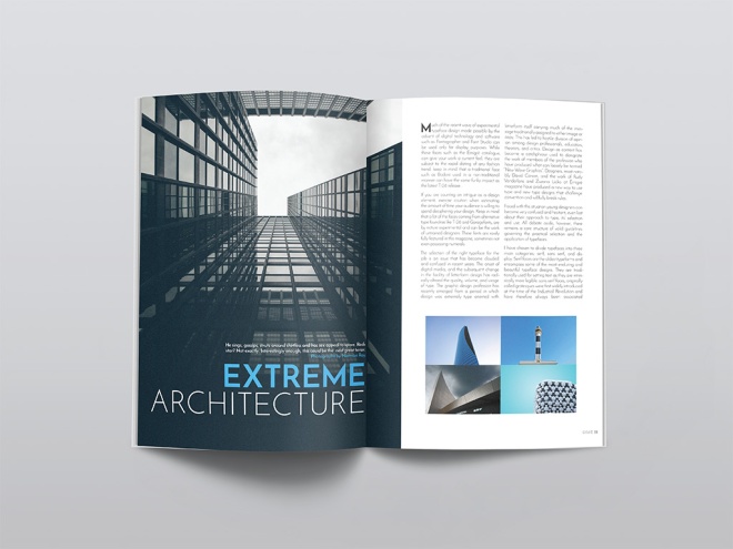
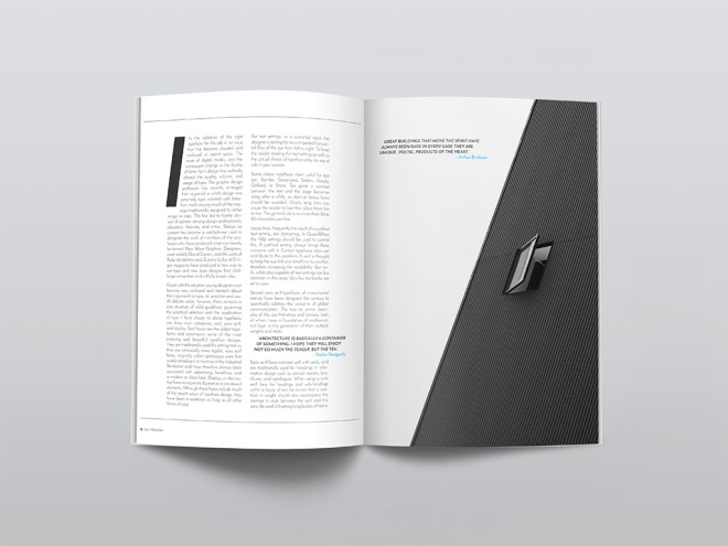
We were to create, name and design a magazine that fits into an existing category: fashion, music, design, men’s style, architecture, food, etc. I started by creating a fun creative logo for the magazine, then I experimented with different typography choices to find the most suitable typeface for my audience. Stock images were sourced that offer an architectual feel to the magazine, which also helped to design each page layout. The light use of colour played a role as well, using complimentary colours throughout the magazine. Page elements, styles, pull quotes and folios were also used in Indesign to achieve the overall design of my architecture magazine.
Box Package Design Band-Aid
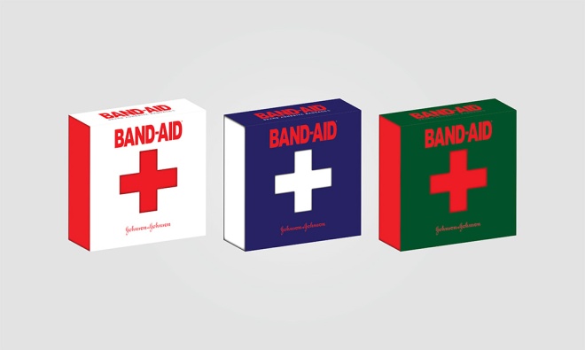
One of the final big projects for the program was to create a box package design for any type of product. Students were to design everything from the production artwork to the final mock-up prototype for this product. Market research, identifying the target audience and conceptualizing played a major role in guiding the success of this project. Designing this product involved creating die-line mechanicals, specifying the custom cut-lines to accommodate glue flaps, folding tabs, etc. The final production artwork includes the necessary die-lines, bleed, measurements and spot colour requirements.
I am very happy how this project turned out, it was probably one of my favorite assignments to work on. Have a look at my design process.
Product Ideas, Sketches and Market Research.
Die-Line Mechanicals, Bleed, Measurements and Final Artwork.
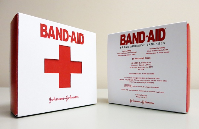
Final 3D Package Rending
Final Result: The physical prototype
Revised – Composite – American Express

Client
The American Express Company, also known as Amex, is an American multinational financial services corporation headquartered in Manhattan’s Three World Financial Center in New York City, United States. Founded in 1850, it is one of the 30 components of the Dow Jones Industrial Average. The company is best known for its credit card, charge card, and traveler’s cheque businesses. Amex cards account for approximately 24% of the total dollar volume of credit card transactions in the U.S.
BusinessWeek and Interbrand ranked American Express as the 22nd most valuable brand in the world, estimating the brand to be worth US$14.97 billion. Fortune listed Amex as one of the top 20 Most Admired Companies in the World. The American Express Reward program is unique as it works on a more personal level with members to help create experiences. Added value to the brand comes from the affluent nature of their history and the exclusivity of their products. Anyone can get a credit card but only a select few can get an American Express.
The company’s logo, adopted in 1958, is a Centurion whose image appears on the company’s travelers’ cheques, charge cards and credit cards.
The Ad Campaign will focus on informing the reader to Realise The Potential when using an American Express credit card. The overall feeling and mood for this campaign will be true to the brand identity, with a modern, simple design that outlines some of the rewards in a creative and playful style.
Target Audience
The primary target audience for this ad campaign will be both male and female between 24-30 years of age. They are well educated, young professionals. They live in urban cities around the world. They may have a minimum income of $40,000. They enjoy going out on the town, seeing concerts, going to sporting events, traveling to and shopping in beautiful vacation destinations.
Magazine
Vanity Fair is a magazine of popular culture, fashion, and current affairs published by Condé Nast. The three ad’s will run in individual issues throughout the summer months of June, July and August of 2016. The ads will run during the summer months because of the warm weather, which allows people to take more time off for vacations and will be able to do a lot more during that time.
Design Strategy
My design strategy was to create three ads that visually worked together and as an individual print ad. I wanted to create something visually appearing to the reader. I used illustrator to create objects that portrayed a message in each ad. The use of a black background with red and gold objects grabs the readers attention even while flipping quickly through the magazine. The type used is clean and easy to read and the use of white and yellow colors makes it stand out from the background. The company logo and credit card were found from online sources (brandsoftheworld.com and Google)and were added to the print ads to inform the reader who the ad is for and where the reader can join to become an executive member of the program.
(Below are some sketches and ideas I had while researching for my ads)


Concept
The main theme of the Ad Campaign will be to entice the reader that they can to do much more when using their American Express credit card. With the American Express tag line written on each ad in white, “Realize The Potential” the reader will imagine all the rewarding possibilities of using an American Express credit card. A website address will also direct the reader to the companies online site to apply for membership if not already a card holder. A sleek and simple design that gets the message across quickly yet visually appealing.
First Ad
The first ad is on a black background with an illustration of a pair of red VIP tickets in the middle of the page indicating that being a member gives you the chance to get exclusive tickets to private events. Tag line reads, “Realise the potential”. Along with an American Express credit card, logo and website, that informs the reader of further information. The font is white to contrast from the dark background with the website being yellow which also stands out from the background and ties to the design colors.

Second Ad
The second ad is on a background with an illustration of a red carpet and velvet rope lines entering into a door indicating no line ups to red carpet events. The tag line reads, “Realise the potential”. Along with an American Express credit card, logo and website, that informs the reader of further information. The font is mostly all white to contrast from the dark background with the website being yellow which also stands out from the background and ties to the overall design colors.

Third Ad
The third ad is also on a black background with an illustration of two red exclusive front row seats indicating to the reader that being a member with American Express you have the possibility to get front row seats at a concert, event or even a private show. The tag line reads, “Realise the potential”. Along with an American Express credit card, logo and website, that informs the reader of further information. The font is mostly all white to contrast from the dark background with the website being yellow which also stands out from the background and ties to the overall design in all three ads.

The use of simple red and gold objects on a black background will be eye catching to the reader. The color red is very well known to be attractive to the human eye. The use of illustrations ties to the American Express brand which allows it to be simple and playful. With white text written on the ad, the message will stand out to the reader making it very easy to read and understand the overall message being portrayed.
Challenges & Solutions
I decided to do my three ad campaign all in Adobe Illustrator. The challenge for me was to be able to design three ads only using illustrator, a software that is not familiar to me. I’m more of a Photoshop guy and I wanted to really challenge myself with new software and techniques. I found some of my challenges to be creating realistic objects for my ads. Creating gradients that looked like chrome and using shadows to make some of the objects believable and realistic. Learning how to create an object and playing with the blending tools, perspective tool and mastering the pen tool was quite a challenge but I feel I created something that worked well and sells the product to the reader. Once I had all my objects drawn I needed to make all three of them uniform. By doing that I needed to resize all the tag lines, logos and objects on each individual ad to fit into the page outline provided by the magazine’s print specs.
The Pitch
I feel that my ad campaign will be successful because it’s simple, clean and pops off the page. The reader only has the attention span of around three seconds when flipping through a magazine. So the use of bright red objects on a black page would work well to catch the readers attention. I feel the reader would really care about this product because who wouldn’t want to feel like an exclusive member of something. My ads sell an experience to the reader, an experience that they may not get to experience with other credit card companies. Exclusive tickets to the hottest party in town, premier red carpet events and even front row seats on Broadway. An experience of a lifetime!
Realise The Potential with American Express.
BELMONTE RAW

Belmonte Raw
It looks like the juice craze and a lifestyle of healthy eating is going strong up in Canada. Belamonte Raw is a Canadian based delivery service that specializes in raw, organic juices and foods. Founded by the company’s namesake Carol Belamonte, the company grew fast and quickly outgrew its original brand identity.
“Over six years ago Carol Belmonte launched Belmonte Raw by bringing salads via bicycle to hungry office workers. At the time of their inception, there were no organic places offering what Belmonte Raw was creating.”

Designer David Taylor was the man for this project. He saw the need to create an identity that differentiated the premium quality of Belamonte Raw’s products from the rest of the playful juice branding in the marketplace. Taylor designed a monogram of the company initials with the name typset below in an all caps, san serif font. This combined with a black and white color palette created a clean, classic brand foundation.
“A paired down palette allowed the color of the food to shine and communications were lead by brand statements that brought the product to life.”


Juices and cleanses are a large and important part of the company’s product line, so there needed to be a relatively easy solution to differentiating the different flavors. Each clear glass bottle has the company’s name screen printed on it for consistency. Wrap around labels are then placed on the bottles with juice name & ingredients being customizable.
Of course bright orange carrot juice is easy to spot, but it’s not so easy to figure out the difference between all the shades of green. This was solved by placing a large number onto each label which correlates to a description on the menu. “I’ll take the #5 please.” I love the order by numbers because it’s easier philosophy in life!


A final, almost overlooked, design element which Taylor included was an underline beneath the letter “E” in Belamonte. This emphasized the fact that the “E” should be pronounced, rather than silent. It also created a tool for brand enlightenment and then was integrated into other areas of the design work. A little goes a long way with this well-developed brand identity, the consistency throughout the packaging and all other touch points of customer facing materials is impressive. Nice work Mr. David Taylor!

Designed by Awake Studio Country: Canada
Originally posted on: thedieline.com
The Anatomy of Typography

This week in class we learned about the anatomy of typography. Typography is an art and a technique that arranges type to make it more readable, legible and visually appealing when displayed. The arrangement of type involves selecting typefaces, point size, line length, line-spacing (leading), letter-spacing (tracking), and adjusting the space within letters pairs (kerning). At first it all seemed overwhelming to me but I watched a few tutorials on the topic and I actually started to understand it. I’ve come to respect the amount of detail that goes into the art of typography. Who knew there was so much behind the font and type we see everywhere now a days? From corporate branding to logos and even t-shirt designs. It’s everywhere and understanding it is an art all on it’s own. Here is a break down of the rules and structure behind typography. I’ve also added a couple video links that might help you understand it better, hope you enjoy.
Anatomy of Type

Ampersand
A stylized character of the Latin et used to represent the word and.
Definition: The typographic symbol used to designate the word and (&) is the Latin symbol for et which means and. The name, ampersand, is believed to be derived from the phrase “and per se and.” On a standard English layout keyboard the ampersand (&) is accessed with shift+7. In many fonts the ampersand looks much like a cursive S or a curvy plus sign but in other fonts you can almost see the word Et in the design of the ampersand.
Also Known As: & | and

Aperture
The partially enclosed, somewhat rounded negative space in some characters.
Definition: The aperture is the partially enclosed, somewhat rounded negative space in some characters such as n, C, S, the lower part of e, or the upper part of a double-story a.
Also Known As: counter

Apex
A point at the top of a character where two strokes meet.
Definition: The point at the top of a character such as the uppercase A where the left and right strokes meet is the apex. The apex may be a sharp point, blunt, or rounded and is an identifying feature for some typefaces.
Also Known As: top

Arc of Stem
A curved stroke that is continuous with a straight stem.

Arm
A horizontal or upward, sloping stroke that does not connect to a stroke or stem on one or both ends.
Definition: The arm of a letter is the horizontal stroke on some characters that does not connect to a stroke or stem at one or both ends. The top of the capital T and the horizontal strokes of the F and E are examples of arms. Additionally, the diagonal upward stroke on a K is its arm. Sometimes arm is used interchangeably with bar or crossbar or cross stroke.
Arm is often also used to describe the mostly horizontal top stroke of C, double-story a, G, and other glyphs, to include the finial, terminal, spur, or other elements of the stroke.
Also Known As: crossbar, cross stroke

Ascender
An upward vertical stroke found on the part of lowercase letters that extends above the typeface’s x-height.
Definition: In typography, the upward vertical stem on some lowercase letters, such as h and b, that extends above the x-height is the ascender. The height of the ascenders is an identifying characteristic of many typefaces.
The ascenders of some letters may touch or almost touch letters in the line above causing awkward or distracting patterns. This is most likely to happen or be obvious when a line of text with tall ascenders is below a line of text with long descenders. To resolve the problem of touching ascenders and descenders you can: Increase the leading (line spacing) between lines of type; Choose a different typeface; For headlines and subheads, some careful editing/re-wording can eliminate the problem; Changing the alignment of the text may also help.

Ascender Line
The invisible line marking the height of ascenders in a font.

Ascent Line
The invisible line marking the farthest distance between the baseline and the top of the glyph.

Axis
An imaginary line drawn from top to bottom of a glyph bisecting the upper and lower strokes is the axis.
Definition: An imaginary line drawn from top to bottom of a glyph bisecting the upper and lower strokes is the axis. For typefaces that exhibit changes in the thickness of curved strokes, the inclination of the axis of the lowercase o is used to measure the angle of stress. A completely vertical axis indicates a design with an angle of 0 or vertical stress. When the axis leans to the left or right the design has angled (positive or negative) stress. Early styles of typefaces generally shared similar axis or stress angles.
The axis or design axis is also an adjustable attribute of some fonts, such as Multiple Master fonts. Adjusting the design axis results in variations in the weight, width, size, and other features of the typeface.
Also Known As: stress, angle of stress, design axis

Ball Terminal
A circular form at the end of the arm in letters.
Definition: In typography, the terminal is a type of curve. Many sources consider a terminal to be just the end (straight or curved) of any stroke that doesn’t include a serif (which can include serif fonts, such as the little stroke at the end of “n” as shown in the illustration). Some curved bits of tails, links, ears, and loops are considered terminals using the broader definition (see the Microsoft Typography site for further explanation).
Ball terminal is a combination of a dot (tail dot) or circular stroke and the curved bit (hook) at the end of some tails and the end of some arms (a, c, f). Beak terminal refers to the sharp spur or beak at the end of a letterform’s arm and the curved bit (terminal) between the beak and the arm.

Bar
The horizontal stroke in letters. Also referred to as Crossbar.
Definition: The (usually) horizontal stroke across the middle of uppercase A and H is a bar. The horizontal or sloping stroke enclosing the bottom of the eye of an e is also a bar. Although often used interchangeably, the bar differs from an arm and a cross stroke because each end connects to a stem or stroke and doesn’t (usually) intersect/cross over the stem or stroke. The varying positioning, thickness, and slope of the bar is an identifying feature of many type designs.
Also Known As: crossbar, arm, cross stroke

Baseline
The invisible line where all characters sit.
Definition: In typography, the baseline is the imaginary line upon which a line of text rests. In most typefaces, the descenders on characters such as g or p extend down below the baseline while curved letters such as c or o extend ever-so-slightly below the baseline. The baseline is the point from which other elements of type are measured including x-height and leading. The baseline is also significant in the alignment of drop caps and other page elements.

Beak
A sharp spur, found particularly at the top of letters in some 20th century Romans.
Definition: A beak is a type of decorative stroke at the end of the arm of a letter, connected to the arm by the terminal. Similar to a spur or serif, it is usually more pronounced.

Bilateral Serifs
A serif extending to both sides of a main stroke. They are reflexive.

Body Height
The complete area covered by all of the characters in a font.

Bowl
The fully closed, rounded part of a letter.
Definition: In typography, the curved part of the character that encloses the circular or curved parts (counter) of some letters such as d, b, o, D, and B is the bowl. Some sources call any parts of a letter enclosing a space a bowl, including both parts of a double-story g and the straight stem on a D or B. The curved strokes of a C are sometimes also referred to as bowls although they aren’t closed.
The shape and size of the counter and bowl can affect readability and is also an identifying factor for some typefaces.
At small sizes or at low resolution the bowls of some letters may fill in and appear solid. Print at a larger size, higher resolution, or change to a different typeface if this becomes an issue. Heavy typefaces or ones with normally small bowls and counters are especially prone to closing up.

Bracket
A curved or wedge-like connection between the stem and serif of some fonts. Not all serifs are bracketed serifs.
Definition: The bracket is a curved or wedge-like connection between the stem and serif of some fonts. Not all serifs are bracketed serifs.
Brackets can have different shapes with deep or gentle curves. Brackets may taper all the way to the end of the serif or attach at a midpoint before the serif ends.

Cap Height
The height of a capital letter measured from the baseline.

Cap Line
A line marking the height of uppercase letters within a font.

Counter
The open space in a fully or partly closed area within a letter.
Definition: In typography, the enclosed or partially enclosed circular or curved negative space (white space) of some letters such as d, o, and s is the counter. The term counter may sometimes be used to refer only to closed space, while partially enclosed spaces in m, n, or h are the aperture. The shape and size of the counter and bowl (curved stroke enclosing the counter) can affect readability and is also an identifying factor for some typefaces.
Also Known As: aperture, inner space, enclosed space

Cross Stroke
A horizontal stroke that intersects the stem of a lowercase t or f.
Definition: The horizontal stroke across the stem of a lowercase t or f is a cross stroke. Although often used interchangeably, the cross stroke differs from an arm and a crossbar because it intersects/crosses over the stem. The varying positioning, thickness, and slope of the cross stroke is an identifying feature of many type designs.
Also Known As: arm, crossbar

Crossbar
The horizontal stroke in letters. Also known as a Bar.
Definition: The (usually) horizontal stroke across the middle of uppercase A and H is a crossbar. The horizontal or sloping stroke enclosing the bottom of the eye of an e is also a crossbar. Although often used interchangeably, the crossbar differs from an arm and a cross stroke because each end connects to a stem or stroke and doesn’t (usually) intersect/cross over the stem or stroke. The varying positioning, thickness, and slope of the bar is an identifying feature of many type designs.
Also Known As: bar, arm, cross stroke

Crotch
An acute, inside angle where two strokes meet.

Descender
The part of the letters that extends below the baseline.
Definition: The portion of some lowercase letters, such as g and y, that extends or descends below the baseline is the descender. The length and shape of the descender can affect readability of lines of type and is an identifying factor for some typefaces.
The descenders of some letters may touch or almost touch letters in the line below causing awkward or distracting patterns. This is most likely to happen or be obvious when a line of text with long descenders is above a line of text with tall ascenders and capital letters. Some solutions include: Increase the leading (line spacing) between lines of type; Choose a different typeface; For headlines and subheads, some careful editing/re-wording can eliminate the problem; Changing the alignment of the text may also help.
Also Known As: extender, tail, loop

Descender Line
The invisible line marking the lowest point of the descenders within a font.

Descent Line
The invisible line marking the farthest distance between the baseline and the bottom of the glyph.

Diacritic
A ancillary mark or sign added to a letter.
Definition: Diacriticals are the accent marks used on some characters to denote a specific pronunciation. Rare in English, they are a common occurrence in French, German, Italian, Spanish, and other languages. Some of the more commonly seen diacriticals include acute, cedilla, circumflex, grave, tilde, and umlaut.
Also Known As: accents, accent marks

Diagonal Stroke
An angled stroke.

Dot
A small distinguishing mark, such as an diacritic on a lowercase i or j. Also known as a Tittle.

Ear
A small stroke extending from the upper-right side of the bowl of lowercase g; also appears in the angled or curved lowercase r.

Eye
Much like a counter, the eye refers specifically to the enclosed space in a lowercase ‘e’.
Definition: Much like a counter, the eye refers specifically to the enclosed space in a lowercase e.
Also Known As: counter

Finial
A tapered or curved end.
Definition: The part of a letter known as a finial is usually a somewhat tapered curved end on letters such as the bottom of C or e or the top of a double-storey a.
Another definition for finial is a swash or ornamental flourish, much like an extended serif, ascender, or descender, often added as a variation to some characters in a typeface.
Also Known As: terminal

Flag
The horizontal stroke present on the numeral 5.

Hairline
A thin stroke usually common to serif typefaces.
Definition: In typeface anatomy, a hairline is the thinnest stroke found in a specific typeface that consists of strokes of varying widths. Hairline is often used to refer to a hairline rule, the thinnest graphic rule (line) printable on a specific output device. Hair or hairline is also a type of serif, the minimum thickness for a serif.
Also Known As: hair stroke

Hook
A curved, protruding stroke in a terminal. Usually found on a lowercase f.

Italics
A cursive alphabet which is matched with a roman font and used along chiefly for emphasis.
Definition: While roman typefaces are upright, italic typefaces slant to the right. But rather than being just a slanted or tilted version of the roman face, a true or pure italic font is drawn from scratch and has unique features not found in the roman face.
Most word processing and desktop publishing programs have an option to turn a roman font into italic. If a matching italic version is installed, this may work fine. However, if an italic version is not available, some programs will create fake italics by simply slanting the roman typeface.
Venetian printer Aldus Manutius and his type designer, Francesco Griffo are credited with creating the first italic typeface — the term italic paying homage to Italy where the style originated.
Also Known As: oblique, tilted, slanted

Leg
Short, descending portion of a letter.
Definition: The lower, down sloping stroke of the K and k is called a leg. The same stroke on R as well as the tail of a Q is sometimes also called a leg.
Also Known As: tail

Ligature
Two or more letters are joined together to form one glyph or character.
Definition: Two or more letters combined into one character make a ligature. In typography some ligatures represent specific sounds or words such as the AE or æ diphthong ligature. Other ligatures are primarily to make type more attractive on the page such as the fl and fi ligatures. In most cases, a ligature is only available in extended characters sets or special expert sets of fonts.
Ligatures used to improve the appearance of type are usually character pairs or triplets that have features that tend to overlap when used together. The ligature creates a smoother transition or connection between characters by connecting crossbars, removing dots over the i, or otherwise altering the shape of the characters.

Link
A stroke that connects the top and bottom bowls of lowercase double-story g’s.
Definition: In typeface anatomy, the link is that small, usually curved stroke that connects the bowl and loop of a double-storey g.
Also Known As: neck, terminal

Lobe
A rounded projecting stoke attached to the main structure of a letter.

Loop
The enclosed or partially enclosed counter below the baseline of a double-story g.
Definition: In a double-story g, the loop is the enclosed or partially enclosed counter below the baseline that is connected to the bowl by a link. The enclosed or partially enclosed extenders on cursive p, b, l, and similar letters are also called loops. Both uppercase and lowercase cursive letters often have extra loops and flourishes. Sometimes the small curve or hook at the end of a j or q is called a loop although it really isn’t.

Lowercase
The smaller form of letters in a typeface.
Definition: The little letters or non-capital letters of the alphabet are lowercase glyphs. They make up the bulk of written text, with uppercase or capital letters used primarily only to start sentences or proper names.
The term lowercase is derived from the days of metal type where the more frequently used letters were kept near at hand in the lower case while the less frequently used capital letters were kept in the harder to reach upper case.
Also Known As: l.c. | little letters | small letters

Mean Line
Imaginary line running along the top of non-ascending, lowercase letters. The mean line falls at the top of many lowercase letters such as “e,” “g” and “y.” It is also at the curve of letters like “h.”

Old-Style Figures
Numbers with varying heights, some aligning to the baseline and some below.
Definition: Style of Arabic Numerals where the characters appear at different positions and heights as opposed to the modern style of all numerals at the same size and position are called Old Style Figures. Some Old Style figures sit entirely above the baseline while others (such as the tail on the numeral 9) descend below the baseline. Often Old Style Figures are available only in Expert Character Sets although some fonts may come with both Old Style Figures and Lining Figures (those that sit on the baseline).
Also Known As: ornamental figures, old style numerals, non-lining

Open Counter
The partially open space within a character that is open on one end.

Overshoot
Ascenders extending into the space of a following character.

Quaint
An antiquated sort or glyph, used to recreate the typographic flavor of a bygone age.

Serif
A stroke added as a stop to the beginning and end of the main strokes of a character.
Definition: In typography, a serif is the little extra stroke found at the end of main vertical and horizontal strokes of some letter-forms. Serifs fall into various groups and can be generally described as hairline (hair), square (slab), or wedge and are either bracketed or unbracketed.
Hairline serifs are much thinner than the main strokes. Square or slab serifs are thicker than hairline serifs all the way up heavier weight than the main strokes. Wedge serifs are triangular in shape. Unbracketed serifs attach directly to the strokes of the letter-form, sometimes abruptly or at right angles. Bracketed serifs provide a curved transition between the serif and the main strokes. Within these divisions serifs can be blunt, rounded, tapered, pointed, or some hybrid shape.
Some special serif-like character parts are spurs and beaks.

Shoulder
The curved stroke aiming downward from a stem.

Spine
The main curved stroke of a lowercase or capital S.
Definition: The spine is the main left to right curving stroke in S and s. The spine may be almost vertical or mostly horizontal, depending on the typeface.
Beyond typography, a spine is specific type of a mathematical curve and the tool used for drawing it.

Spur
A small projection off a main stroke.

Stem
Vertical, full-length stroke in upright characters.

Stroke
A straight or curved diagonal line.
Definition: The main diagonal portion of a letter-form such as in N, M, or Y is the stroke. The stroke is secondary to the main stem(s). Some letter-forms with two diagonals, such as A or V have a stem (the primary vertical or near-vertical stroke) and a stroke (the main diagonal).
Other letter parts such as bars, arms, stems, and bowls are collectively referred to as the strokes that make up a letter-form.

Swash
A flourish addition replacing a terminal or serif.

Tail
A descending stroke, often decorative.
Definition: In typography, the descending, often decorative stroke on the letter Q or the descending, often curved diagonal stroke on K or R is the tail. The descender on g, j, p, q, and y are also called tails.

Teardrop Terminal
The tear dropped ends of strokes in letters of some typefaces.

Terminal
The end of a stroke that does not include a serif.
Definition: In typography, the terminal is a type of curve. Many sources consider a terminal to be just the end (straight or curved) of any stroke that doesn’t include a serif (which can include serif fonts, such as the little stroke at the end of “n” as shown in the illustration). Some curved bits of tails, links, ears, and loops are considered terminals using the broader definition (see the Microsoft Typography site for further explanation).
Ball terminal is a combination of a dot (tail dot) or circular stroke and the curved bit (hook) at the end of some tails and the end of some arms (a, c, f). Beak terminal refers to the sharp spur or beak at the end of a letter-form’s arm and the curved bit (terminal) between the beak and the arm.

Tittle
A small distinguishing mark, such as an diacritic on a lowercase i or j. Also known as a Dot.
Credits: about.com, wikipedia.com, typographydeconstructed.com, lynda.com
