Check out my new site, it has a new look. marekszkudlarek.com
Typography
Typography. Interesting fonts and inspirations from every day life.
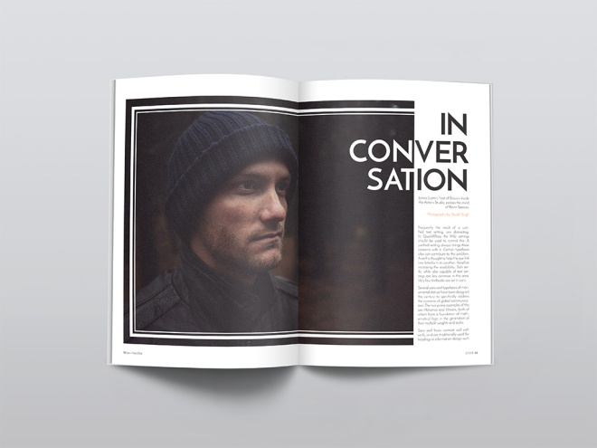
Final Portfolio Presentation
Magazine Print Layout
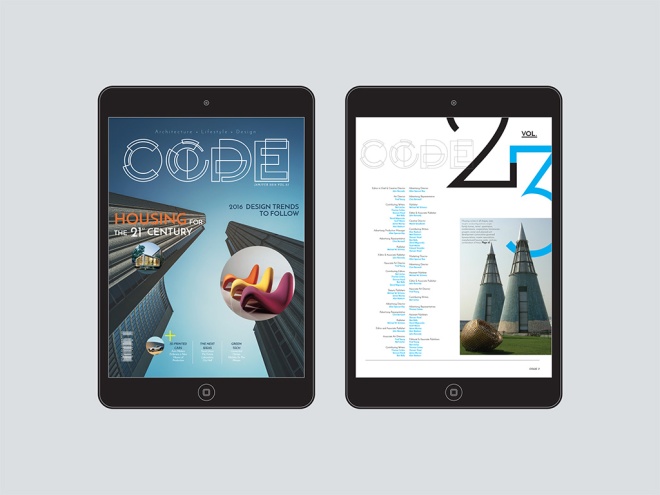
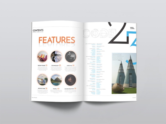
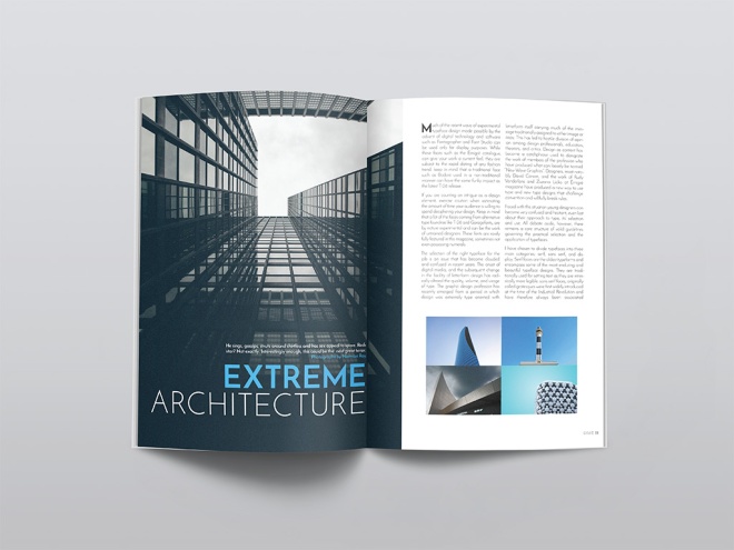
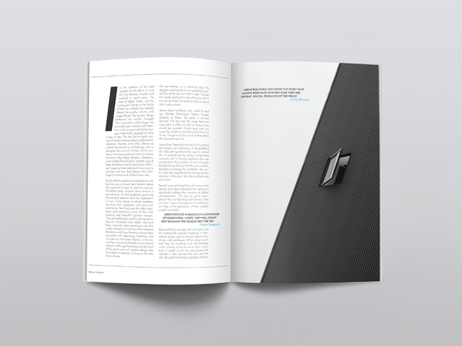
We were to create, name and design a magazine that fits into an existing category: fashion, music, design, men’s style, architecture, food, etc. I started by creating a fun creative logo for the magazine, then I experimented with different typography choices to find the most suitable typeface for my audience. Stock images were sourced that offer an architectual feel to the magazine, which also helped to design each page layout. The light use of colour played a role as well, using complimentary colours throughout the magazine. Page elements, styles, pull quotes and folios were also used in Indesign to achieve the overall design of my architecture magazine.
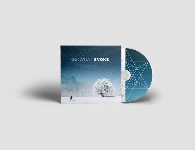
COMPOSITE #2: CD RELEASE & WEBSITE

PROJECT SUMMARY
The band I chose for my CD project is Snowday, a chill-out electronic duo from Toronto, Canada. Cam Sloan and Chad Skinner went back to the basics, jamming with small acoustic instruments they collected throughout their travels in Europe. Their newfound appreciation for acoustic textures coloured the material they recorded upon their return home. This sound became Snowday’s first songs. Fans are both male and female, in the early 20’s to late 30’s age group. It is not uncommon to hear their music in a lounge setting while enjoying an exceptional beverage in a swank hotel bar.
The two friends met in high school and have made music together in various projects and bonded over a mutual love of underground hip-hop from their home town of Ottawa. Later inspired by the records they were sampling and with a desire to become better performers, they taught themselves to play their own instruments. Everything from piano, guitar and more wordly, less common instruments paved the foundation for Snowday’s live organic approach to ambient pop.Cam and Chad are only just beginning to develop their branding identity, so it was a great opportunity to produce the album artwork and overall style of the printed media. I decided on a ‘single-page’ scroll layout for the website, with a fixed navigation menu at the top, which linked to each section of the page: Home, Bio, Tour, Media, and Contact – with links to social media including Twitter, Facebook, Instagram, YouTube and Sound Cloud. The images were sourced from the bands online site, however, stock images were used for the header and the CD package design. All written text was sourced from the band, although details such as tour dates were fabricated in order to reflect the unconfirmed future performances.
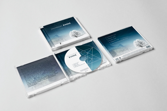
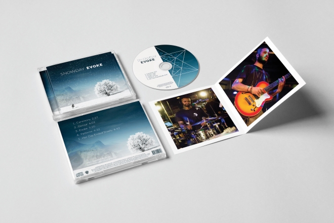
Their upcoming debut album, Evoke is a chill-out, feel good, sensual as it is psychedelic. Swirling synths and laid back guitars swim in washes of liquid reverb and sparkling delays, all gently propelled by an understated and pulsing rhythm. The majority of the album is instrumental and meditative, broken up by ethereal violin sounds by Jessie Lyon and heart-racing drum performance by Paul T. Geldart.The design of both CD and website incorporates many functional elements such as live media links to audio/video and an image gallery. The colour palette and the consistency
of it’s use played a big role in tying all the pieces together. The website keeps fans up-to-date on upcoming shows and performances in the Tour section. Fans are able to explore the band and their music on a more personal and intuitive level, allowing them to take away an appreciation for the style rather than be told how to enjoy the experience.
Have a look at my final CD mock ups.
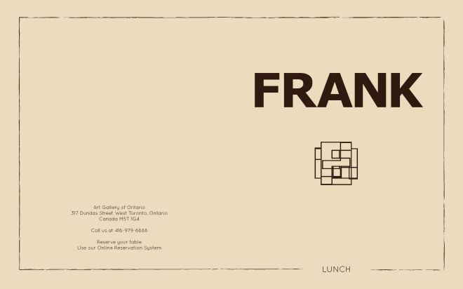
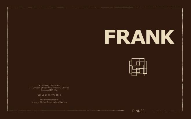
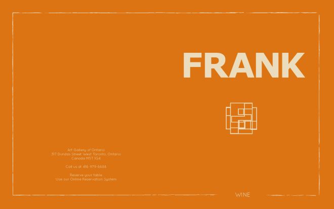
FRANK MENU RE-DESIGN
I began by looking at the The AGO ‘s website to get a better understanding of their style. I reviewed a history of Frank Gehry’s work so I could familiarize myself with his unique (and surprisingly playful) creativity. I designed two mood boards with two individual themes. From there, I looked at various type options and colour palettes that were consistent with the style of both the venue and the artist who’s name the restaurant was named after.
The colours were inspired by the museums incredible use of wood, the font was chosen to be simple and minimally distracting. I wanted the menu to be a reflection of both The AGO and Frank Gehry. Some of the challenges I found with this project came when trying to decide how to incorporate the artists unconventional style into a menu filled with text. In the end, I think thoughtful placement and simplicity allow the two elements to work well together. The cover was meant to pay tribute to Frank, so I wanted his name to be the forefront. Everything else was just a compliment. I really enjoy the cubic “F” design I created in Illustrator, which plays homage to both the visual and the architectural components of the museum.
Check out my menu re-design for Frank at the AGO.
Protected: Composite #2 Proposal
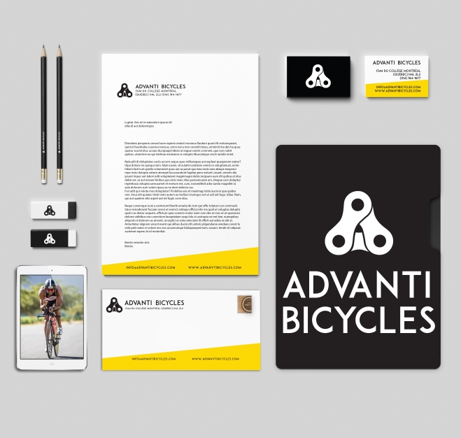
Corporate ID Project
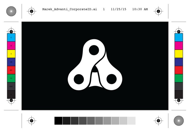
Our Corporate ID project has finally come to an end. Printed, mounted and handed in along with a very cool folder to go with it. We were assigned an imaginary company based on a real world company for inspiration. We were asked to create a corporate stationary for that company which included a new logo, a front and back business card, letter head and envelope. We were to sketch out designs and afterwards create three vector logos and choose a final design to create our stationary with.
My company was called Advanti Bicycles. Originally from Montreal, Quebec, they are a high end bike company that specialize in racing bicycles for triathlons. They have won design awards and their bicycles have been raced by top athletes in the Tour de France. Their product has an innovative frame design for rigidity, comfort and is exceptionally lightweight. The bicycles feature better front end stiffness, more precise handling, an uncompromising racing frame and a position perfectly adopted to the individual’s physique and riding preferences.
The target market for Advanti Bicycles are mainly healthy men between the ages of 24-35, with a starting income of $40,000. Located worldwide, concentrated in North America and Europe.
I had some logo ideas in mind but I wasn’t exactly sure what I wanted to create. I sketched a few shapes, shapes lead to lines, lines lead to gears and then some squiggly lines and then even a pineapple! Who wouldn’t want a gold metal plated pineapple on the head of their bike?! I would. However, that didn’t end up being the logo in the end. After hours of playing in illustrator and using the Adobe Capture app on iOS to create custom vector shapes from a photos I have taken, I ended up creating multiple logo designs and type choices for my brand.
Have a look at the process I took to create this brand identity for Advanti Bicycles.
Revised – Composite – American Express

Client
The American Express Company, also known as Amex, is an American multinational financial services corporation headquartered in Manhattan’s Three World Financial Center in New York City, United States. Founded in 1850, it is one of the 30 components of the Dow Jones Industrial Average. The company is best known for its credit card, charge card, and traveler’s cheque businesses. Amex cards account for approximately 24% of the total dollar volume of credit card transactions in the U.S.
BusinessWeek and Interbrand ranked American Express as the 22nd most valuable brand in the world, estimating the brand to be worth US$14.97 billion. Fortune listed Amex as one of the top 20 Most Admired Companies in the World. The American Express Reward program is unique as it works on a more personal level with members to help create experiences. Added value to the brand comes from the affluent nature of their history and the exclusivity of their products. Anyone can get a credit card but only a select few can get an American Express.
The company’s logo, adopted in 1958, is a Centurion whose image appears on the company’s travelers’ cheques, charge cards and credit cards.
The Ad Campaign will focus on informing the reader to Realise The Potential when using an American Express credit card. The overall feeling and mood for this campaign will be true to the brand identity, with a modern, simple design that outlines some of the rewards in a creative and playful style.
Target Audience
The primary target audience for this ad campaign will be both male and female between 24-30 years of age. They are well educated, young professionals. They live in urban cities around the world. They may have a minimum income of $40,000. They enjoy going out on the town, seeing concerts, going to sporting events, traveling to and shopping in beautiful vacation destinations.
Magazine
Vanity Fair is a magazine of popular culture, fashion, and current affairs published by Condé Nast. The three ad’s will run in individual issues throughout the summer months of June, July and August of 2016. The ads will run during the summer months because of the warm weather, which allows people to take more time off for vacations and will be able to do a lot more during that time.
Design Strategy
My design strategy was to create three ads that visually worked together and as an individual print ad. I wanted to create something visually appearing to the reader. I used illustrator to create objects that portrayed a message in each ad. The use of a black background with red and gold objects grabs the readers attention even while flipping quickly through the magazine. The type used is clean and easy to read and the use of white and yellow colors makes it stand out from the background. The company logo and credit card were found from online sources (brandsoftheworld.com and Google)and were added to the print ads to inform the reader who the ad is for and where the reader can join to become an executive member of the program.
(Below are some sketches and ideas I had while researching for my ads)


Concept
The main theme of the Ad Campaign will be to entice the reader that they can to do much more when using their American Express credit card. With the American Express tag line written on each ad in white, “Realize The Potential” the reader will imagine all the rewarding possibilities of using an American Express credit card. A website address will also direct the reader to the companies online site to apply for membership if not already a card holder. A sleek and simple design that gets the message across quickly yet visually appealing.
First Ad
The first ad is on a black background with an illustration of a pair of red VIP tickets in the middle of the page indicating that being a member gives you the chance to get exclusive tickets to private events. Tag line reads, “Realise the potential”. Along with an American Express credit card, logo and website, that informs the reader of further information. The font is white to contrast from the dark background with the website being yellow which also stands out from the background and ties to the design colors.

Second Ad
The second ad is on a background with an illustration of a red carpet and velvet rope lines entering into a door indicating no line ups to red carpet events. The tag line reads, “Realise the potential”. Along with an American Express credit card, logo and website, that informs the reader of further information. The font is mostly all white to contrast from the dark background with the website being yellow which also stands out from the background and ties to the overall design colors.

Third Ad
The third ad is also on a black background with an illustration of two red exclusive front row seats indicating to the reader that being a member with American Express you have the possibility to get front row seats at a concert, event or even a private show. The tag line reads, “Realise the potential”. Along with an American Express credit card, logo and website, that informs the reader of further information. The font is mostly all white to contrast from the dark background with the website being yellow which also stands out from the background and ties to the overall design in all three ads.

The use of simple red and gold objects on a black background will be eye catching to the reader. The color red is very well known to be attractive to the human eye. The use of illustrations ties to the American Express brand which allows it to be simple and playful. With white text written on the ad, the message will stand out to the reader making it very easy to read and understand the overall message being portrayed.
Challenges & Solutions
I decided to do my three ad campaign all in Adobe Illustrator. The challenge for me was to be able to design three ads only using illustrator, a software that is not familiar to me. I’m more of a Photoshop guy and I wanted to really challenge myself with new software and techniques. I found some of my challenges to be creating realistic objects for my ads. Creating gradients that looked like chrome and using shadows to make some of the objects believable and realistic. Learning how to create an object and playing with the blending tools, perspective tool and mastering the pen tool was quite a challenge but I feel I created something that worked well and sells the product to the reader. Once I had all my objects drawn I needed to make all three of them uniform. By doing that I needed to resize all the tag lines, logos and objects on each individual ad to fit into the page outline provided by the magazine’s print specs.
The Pitch
I feel that my ad campaign will be successful because it’s simple, clean and pops off the page. The reader only has the attention span of around three seconds when flipping through a magazine. So the use of bright red objects on a black page would work well to catch the readers attention. I feel the reader would really care about this product because who wouldn’t want to feel like an exclusive member of something. My ads sell an experience to the reader, an experience that they may not get to experience with other credit card companies. Exclusive tickets to the hottest party in town, premier red carpet events and even front row seats on Broadway. An experience of a lifetime!
Realise The Potential with American Express.
Nuit Blanche

Our final assignment in Typography class was to create a poster for one of three categories, Nuit Blanche, WordCamp or Fringe Festival. I decided to create a poster for Nuit Blanche. I wanted to create something that would stop someone in their tracks and have a long look at the poster. Here’s my break down of the poster. I hope you enjoy!
Target
My target audience for this poster are both male and female age 25 and up. Although this event is open to everyone, I feel it attracts to young professionals. People of all kinds flock to this event to get inspired and explore the wonders created by artists from around the globe. I think that this poster stands out to the target audience because the punch of color used is striking to the eye. The graphics encourage the audience to expand their minds into their personal creative wonderland.
Design
I wanted to create something that not only opens the mind of the viewer but allows them to think creatively before attending the event. I found a silhouette of a dear and dropped a hi res file of nebula onto it and blended the two to create a spacey looking creation of a dear lost in the dark woods; much like the audience will feel wandering the streets surrounded by skyscrapers. With the use of the original Nuit Blanche logo design, I removed the font, kept the swirl and also dropped another image onto it to make it look like a web of explosive imagination was going on in the mind of the dear. The colorful flying origami birds add to the poster because it looks as if they were the ones responsible for the tangled swirl above the dear. The font used was Permanent Marker which I think was a great choice because it reads well, looks good for a bold title and with minimal text on the poster. Supporting sponsors are included at the bottom with their respective logos.
Hierarchy
I wanted to emphasize the most important element of the poster: the what and where. Anyone who catch- es a glimpse of the poster will immediately understand it’s for Nuit Blanche. The exhibits at Nuit Blanche cover a huge range of disciplines and I wanted to use the infinite depth of the universe to convey this. Dear are known to be both magical and spiritual creatures so I think it’s fitting to have this dear silhouetted while supporting the recognizable Nuit Blanche swirl design. The dear is flanked by modern origami birds that also represent the intricacies of exhibits at the show, both large and small. The bottom of the poster includes the website (for more information) and sponsors in a clear and flattering way. As the viewer will most likely only see the poster for a brief moment, I believe that they will easily understand and remember the most important details and be left with a sense of intrigue and excitement at the possibilities waiting for them.
BELMONTE RAW

Belmonte Raw
It looks like the juice craze and a lifestyle of healthy eating is going strong up in Canada. Belamonte Raw is a Canadian based delivery service that specializes in raw, organic juices and foods. Founded by the company’s namesake Carol Belamonte, the company grew fast and quickly outgrew its original brand identity.
“Over six years ago Carol Belmonte launched Belmonte Raw by bringing salads via bicycle to hungry office workers. At the time of their inception, there were no organic places offering what Belmonte Raw was creating.”

Designer David Taylor was the man for this project. He saw the need to create an identity that differentiated the premium quality of Belamonte Raw’s products from the rest of the playful juice branding in the marketplace. Taylor designed a monogram of the company initials with the name typset below in an all caps, san serif font. This combined with a black and white color palette created a clean, classic brand foundation.
“A paired down palette allowed the color of the food to shine and communications were lead by brand statements that brought the product to life.”


Juices and cleanses are a large and important part of the company’s product line, so there needed to be a relatively easy solution to differentiating the different flavors. Each clear glass bottle has the company’s name screen printed on it for consistency. Wrap around labels are then placed on the bottles with juice name & ingredients being customizable.
Of course bright orange carrot juice is easy to spot, but it’s not so easy to figure out the difference between all the shades of green. This was solved by placing a large number onto each label which correlates to a description on the menu. “I’ll take the #5 please.” I love the order by numbers because it’s easier philosophy in life!


A final, almost overlooked, design element which Taylor included was an underline beneath the letter “E” in Belamonte. This emphasized the fact that the “E” should be pronounced, rather than silent. It also created a tool for brand enlightenment and then was integrated into other areas of the design work. A little goes a long way with this well-developed brand identity, the consistency throughout the packaging and all other touch points of customer facing materials is impressive. Nice work Mr. David Taylor!

Designed by Awake Studio Country: Canada
Originally posted on: thedieline.com
