Goodbye Winter…Hello Spring!

penquin2

Image

New Website

Check out my new site, it has a new look. marekszkudlarek.com

New Website

Final Portfolio Presentation

This slideshow requires JavaScript.

View Portfolio

Final Portfolio Presentation

Magazine Print Layout

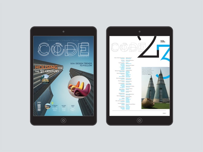
ipad-magazine-mockup

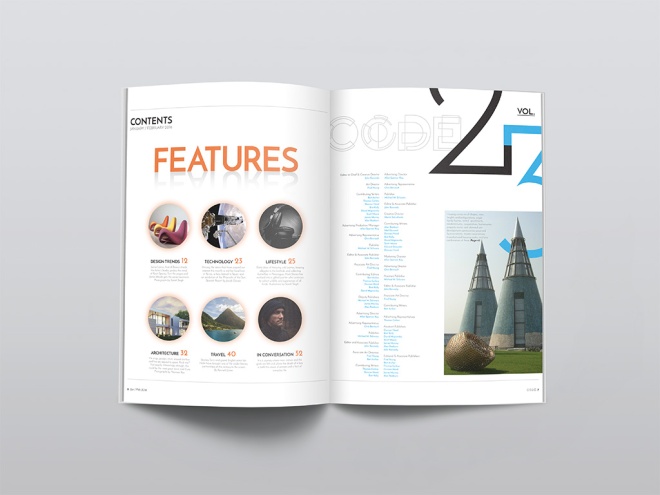
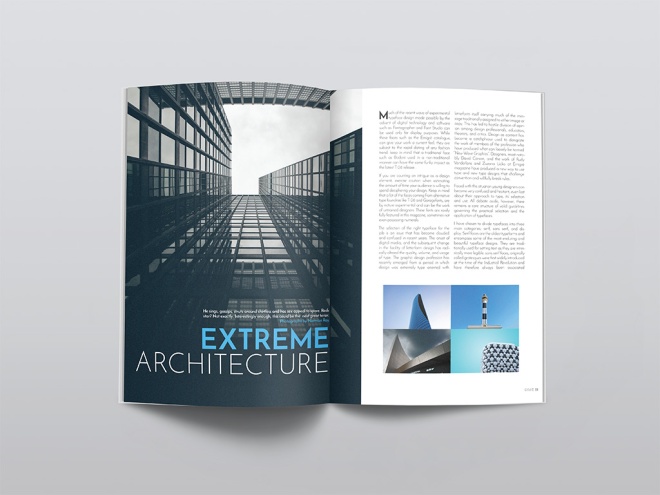
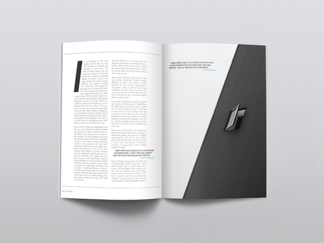
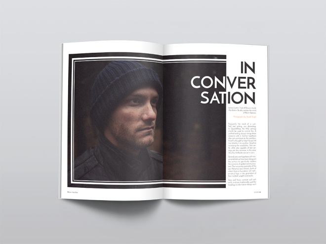
We were to create, name and design a magazine that fits into an existing category: fashion, music, design, men’s style, architecture, food, etc.  I started by creating a fun creative logo for the magazine, then I experimented with different typography choices to find the most suitable typeface for my audience.  Stock images were sourced that offer an architectual feel to the magazine, which also helped to design each page layout.  The light use of colour played a role as well, using complimentary colours throughout the magazine.  Page elements, styles, pull quotes and folios were also used in Indesign to achieve the overall design of my architecture magazine.

magazine-mockup1magazine-mockup2magazine-mockup3magazine-mockup4


Magazine Print Layout

Box Package Design Band-Aid

package-design

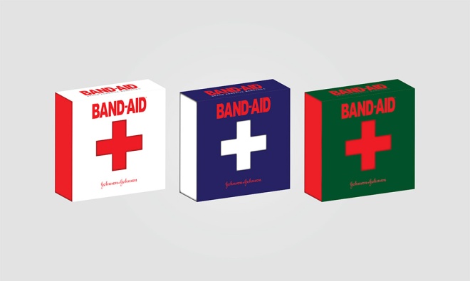
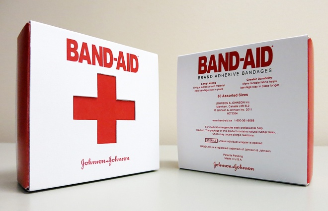
One of the final big projects for the program was to create a box package design for any type of product.  Students were to design everything from the production artwork to the final mock-up prototype for this product.  Market research, identifying the target audience and conceptualizing played a major role in guiding the success of this project. Designing this product involved creating die-line mechanicals, specifying the custom cut-lines to accommodate glue flaps, folding tabs, etc.  The final production artwork includes the necessary die-lines, bleed, measurements and spot colour requirements.

I am very happy how this project turned out, it was probably one of my favorite assignments to work on. Have a look at my design process.

Product Ideas, Sketches and Market Research.

This slideshow requires JavaScript.

Die-Line Mechanicals, Bleed, Measurements and Final Artwork.

This slideshow requires JavaScript.

Final 3D Package Rending

This slideshow requires JavaScript.

Final Result: The physical prototype

bandaid-real

Box Package Design Band-Aid

Techinal Drawing #2

techincaldrawing_marek_handin2

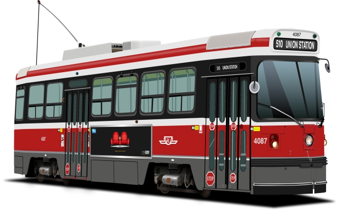
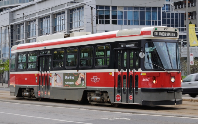
For my technical drawing I chose the very well-known, Toronto Streetcar. I really appreciate the toy-like quality the older streetcar has. I was outside and noticed them passing by, one after another and thought it would be a great subject for this project. I found a high res image online which served as the foundation for my drawing.
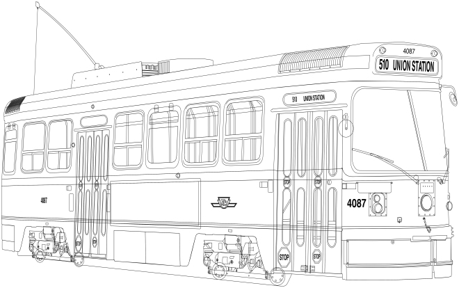
I began the outline process by tracing each element of the streetcar using tools such as the pen tool, the direct select tool, shapes and shape-builder tool, paths and patterns. The process took a little longer than expected but turned into a great learning opportunity. I improved my speed and became a lot more comfortable using the various tools which helped my confidence when it came to coloring and really, using Illustrator in general.

The traced image of the streetcar looked great but I was excited to see what it would look like after coloring. Some of the challenges and successes came from understanding gradient and gradient mesh tool, effects, outline mode, styles, drop shadows, layers and path finder. Organizing layers was not a strong focus during the outline process which made parts of the coloring process more difficult. In the future I am going to prioritize this as I can appreciate how much time I’ll save being more organized. In the end, I found the wheel system the most difficult part to recreate.

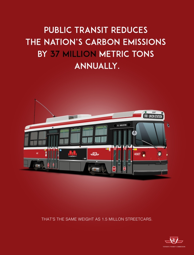
I think the overall image is convincing and represents the classic Toronto Streetcar well. Small details such as the streetcars route, the small stickers, the lights, the chrome detailing and the advertisement on the side (from my previous design project) help to bring it to life. This project has been a tremendously positive experience and I look forward to improving my Illustrator skills further.

Have a look at my process…

The original high resolution image sourced from the web.

techincaldrawing_marek_handin2

First step, create outline using various tools. ie; shape builder, pen tool etc.

techincaldrawing_marek_handin2

Step two, color! Using tools such as live paint, gradient, gradient mesh, effects, transparencies, shadows and textures.

techincaldrawing_marek_handin2

The final ad.

techincaldrawing_marek_handin


Techinal Drawing #2

Revised – Composite – American Express

composite_revised

Client

The American Express Company, also known as Amex, is an American multinational financial services corporation headquartered in Manhattan’s Three World Financial Center in New York City, United States.  Founded in 1850, it is one of the 30 components of the Dow Jones Industrial Average.  The company is best known for its credit card, charge card, and traveler’s cheque businesses. Amex cards account for approximately 24% of the total dollar volume of credit card transactions in the U.S.

BusinessWeek and Interbrand ranked American Express as the 22nd most valuable brand in the world, estimating the brand to be worth US$14.97 billion.  Fortune listed Amex as one of the top 20 Most Admired Companies in the World.  The American Express Reward program is unique as it works on a more personal level with members to help create experiences.  Added value to the brand comes from the affluent nature of their history and the exclusivity of their products.  Anyone can get a credit card but only a select few can get an American Express.

The company’s logo, adopted in 1958, is a Centurion whose image appears on the company’s travelers’ cheques, charge cards and credit cards.

The Ad Campaign will focus on informing the reader to Realise The Potential when using an American Express credit card.  The overall feeling and mood for this campaign will be true to the brand identity, with a modern, simple design that outlines some of the rewards in a creative and playful style.

Target Audience

The primary target audience for this ad campaign will be both male and female between 24-30 years of age.  They are well educated, young professionals.  They live in urban cities around the world.  They may have a minimum income of $40,000.  They enjoy going out on the town, seeing concerts, going to sporting events, traveling to and shopping in beautiful vacation destinations.

Magazine

Vanity Fair is a magazine of popular culture, fashion, and current affairs published by Condé Nast.  The three ad’s will run in individual issues throughout the summer months of June, July and August of 2016.  The ads will run during the summer months because of the warm weather, which allows people to take more time off for vacations and will be able to do a lot more during that time.

Design Strategy

My design strategy was to create three ads that visually worked together and as an individual print ad.  I wanted to create something visually appearing to the reader.  I used illustrator to create objects that portrayed a message in each ad.  The use of a black background with red and gold objects grabs the readers attention even while flipping quickly through the magazine.  The type used is clean and easy to read and the use of white and yellow colors makes it stand out from the background.  The company logo and credit card were found from online sources (brandsoftheworld.com and Google)and were added to the print ads to inform the reader who the ad is for and where the reader can join to become an executive member of the program.

(Below are some sketches and ideas I had while researching for my ads)

Ideas1 Ideas2

RoughSketch1 RoughSketch3 RoughSketch2

Concept

The main theme of the Ad Campaign will be to entice the reader that they can to do much more when using their American Express credit card.  With the American Express tag line written on each ad in white, “Realize The Potential” the reader will imagine all the rewarding possibilities of using an American Express credit card.  A website address will also direct the reader to the companies online site to apply for membership if not already a card holder.  A sleek and simple design that gets the message across quickly yet visually appealing.

First Ad
The first ad is on a black background with an illustration of a pair of red VIP tickets in the middle of the page indicating that being a member gives you the chance to get exclusive tickets to private events. Tag line reads, “Realise the potential”.  Along with an American Express credit card, logo and website, that informs the reader of further information.  The font is white to contrast from the dark background with the website being yellow which also stands out from the background and ties to the design colors.

Marek_Composite_revised_copy2_Artboard 1

Second Ad
The second ad is on a background with an illustration of a red carpet and velvet rope lines entering into a door indicating no line ups to red carpet events.  The tag line reads, “Realise the potential”.  Along with an American Express credit card, logo and website, that informs the reader of further information.   The font is mostly all white to contrast from the dark background with the website being yellow which also stands out from the background and ties to the overall design colors.

Marek_Composite_revised_copy2_Artboard 2

Third Ad
The third ad is also on a black background with an illustration of two red exclusive front row seats indicating to the reader that being a member with American Express you have the possibility to get front row seats at a concert, event or even a private show.  The tag line reads, “Realise the potential”. Along with an American Express credit card, logo and website, that informs the reader of further information.  The font is mostly all white to contrast from the dark background with the website being yellow which also stands out from the background and ties to the overall design in all three ads.

Marek_Composite_revised_copy2_Artboard 3

The use of simple red and gold objects on a black background will be eye catching to the reader.  The color red is very well known to be attractive to the human eye.  The use of illustrations ties to the American Express brand which allows it to be simple and playful.  With white text written on the ad, the message will stand out to the reader making it very easy to read and understand the overall message being portrayed.

Challenges & Solutions

I decided to do my three ad campaign all in Adobe Illustrator.  The challenge for me was to be able to design three ads only using illustrator, a software that is not familiar to me.  I’m more of a Photoshop guy and I wanted to really challenge myself with new software and techniques.  I found some of my challenges to be creating realistic objects for my ads.  Creating gradients that looked like chrome and using shadows to make some of the objects believable and realistic.  Learning how to create an object and playing with the blending tools, perspective tool and mastering the pen tool was quite a challenge but I feel I created something that worked well and sells the product to the reader.  Once I had all my objects drawn I needed to make all three of them uniform.  By doing that I needed to resize all the tag lines, logos and objects on each individual ad to fit into the page outline provided by the magazine’s print specs.

The Pitch

I feel that my ad campaign will be successful because it’s simple, clean and pops off the page.  The reader only has the attention span of around three seconds when flipping through a magazine. So the use of bright red objects on a black page would work well to catch the readers attention.  I feel the reader would really care about this product because who wouldn’t want to feel like an exclusive member of something.  My ads sell an experience to the reader, an experience that they may not get to experience with other credit card companies.  Exclusive tickets to the hottest party in town, premier red carpet events and even front row seats on Broadway.  An experience of a lifetime!

Realise The Potential with American Express.

Revised – Composite – American Express

Nuit Blanche

Nuit Blanche Poster

Our final assignment in Typography class was to create a poster for one of three categories, Nuit Blanche, WordCamp or Fringe Festival.  I decided to create a poster for Nuit Blanche.  I wanted to create something that would stop someone in their tracks and have a long look at the poster.  Here’s my break down of the poster. I hope you enjoy!

Target

My target audience for this poster are both male and female age 25 and up. Although this event is open to everyone, I feel it attracts to young professionals. People of all kinds flock to this event to get inspired and explore the wonders created by artists from around the globe. I think that this poster stands out to the target audience because the punch of color used is striking to the eye. The graphics encourage the audience to expand their minds into their personal creative wonderland.

Design

I wanted to create something that not only opens the mind of the viewer but allows them to think creatively before attending the event. I found a silhouette of a dear and dropped a hi res file of nebula onto it and blended the two to create a spacey looking creation of a dear lost in the dark woods; much like the audience will feel wandering the streets surrounded by skyscrapers. With the use of the original Nuit Blanche logo design, I removed the font, kept the swirl and also dropped another image onto it to make it look like a web of explosive imagination was going on in the mind of the dear. The colorful flying origami birds add to the poster because it looks as if they were the ones responsible for the tangled swirl above the dear. The font used was Permanent Marker which I think was a great choice because it reads well, looks good for a bold title and with minimal text on the poster. Supporting sponsors are included at the bottom with their respective logos.

Hierarchy

I wanted to emphasize the most important element of the poster: the what and where. Anyone who catch- es a glimpse of the poster will immediately understand it’s for Nuit Blanche. The exhibits at Nuit Blanche cover a huge range of disciplines and I wanted to use the infinite depth of the universe to convey this. Dear are known to be both magical and spiritual creatures so I think it’s fitting to have this dear silhouetted while supporting the recognizable Nuit Blanche swirl design. The dear is flanked by modern origami birds that also represent the intricacies of exhibits at the show, both large and small. The bottom of the poster includes the website (for more information) and sponsors in a clear and flattering way. As the viewer will most likely only see the poster for a brief moment, I believe that they will easily understand and remember the most important details and be left with a sense of intrigue and excitement at the possibilities waiting for them.

Nuit Blanche

BELMONTE RAW

-3

Belmonte Raw

It looks like the juice craze and a lifestyle of healthy eating is going strong up in Canada. Belamonte Raw is a Canadian based delivery service that specializes in raw, organic juices and foods. Founded by the company’s namesake Carol Belamonte, the company grew fast and quickly outgrew its original brand identity.

“Over six years ago Carol Belmonte launched Belmonte Raw by bringing salads via bicycle to hungry office workers. At the time of their inception, there were no organic places offering what Belmonte Raw was creating.”

-1

Designer David Taylor was the man for this project. He saw the need to create an identity that differentiated the premium quality of Belamonte Raw’s products from the rest of the playful juice branding in the marketplace. Taylor designed a monogram of the company initials with the name typset below in an all caps, san serif font. This combined with a black and white color palette created a clean, classic brand foundation.

“A paired down palette allowed the color of the food to shine and communications were lead by brand statements that brought the product to life.”

13e48a750c4eb418de273e798180a5b157d630e0aa5607ff3d3c87ba61ad5ecde4d73e195bfa342aa7f9cd5b8c5d43dccf5fc3d674ba330a8653ec16a8f3f185dea82ff82e3fcf4dc77769ff11281721

Juices and cleanses are a large and important part of the company’s product line, so there needed to be a relatively easy solution to differentiating the different flavors. Each clear glass bottle has the company’s name screen printed on it for consistency. Wrap around labels are then placed on the bottles with juice name & ingredients being customizable.

Of course bright orange carrot juice is easy to spot, but it’s not so easy to figure out the difference between all the shades of green. This was solved by placing a large number onto each label which correlates to a description on the menu. “I’ll take the #5 please.” I love the order by numbers because it’s easier philosophy in life!

-2 e36f72a48cb5bb00b10fe85b3b5c6ca17d431ce794862705fce7e22447bcbe9b3b84ed2d6c9b2f2ef76706bd747cfa3a

A final, almost overlooked, design element which Taylor included was an underline beneath the letter “E” in Belamonte. This emphasized the fact that the “E” should be pronounced, rather than silent. It also created a tool for brand enlightenment and then was integrated into other areas of the design work. A little goes a long way with this well-developed brand identity, the consistency throughout the packaging and all other touch points of customer facing materials is impressive. Nice work Mr. David Taylor!

-4

Designed by Awake Studio Country: Canada

Originally posted on: thedieline.com


BELMONTE RAW

What Is A Path? What Is An Anchor Point?

Pen_Tool_The_Exercise copy

Last week in Illustrator class we were introduced to the pen tool.  Personally, I only scratched the surface of Illustrator for a couple of my own designs projects and I’ll be honest, I don’t think I even used the proper tools for the job.  Somehow in the end I created some pretty awesome artwork that I was happy with.  I’m much more familiar with Adobe Photoshop from the many years of having to retouch models skin for magazine clients and model agencies, cleaning up dust and spots from endless products and designer clothing.

When I decided to take this program I was super excited that I’d be leaning how to properly use software such as Adobe Illustrator and Adobe Indesign.  Software that I’ve been in dire need of learning to further my success as an artist in this constantly changing digital world.  I figured that understanding Photoshop would give me a “one up” on Illustrator and Indesgin and even though the software interface is pretty much the same across all three programs, some tools and structures are somewhat different.  I’m very glad to be coming into it as inexperienced as I am because I have a fresh outlook on the programs and I feel there will be plenty to learn.  I’m even grasping new techniques in my Photoshop class!  Who Knew?

Below is a short breakdown of what a path and anchor point are.  I’ve also added a very cool keyboard cheat sheet for Illustrator that I found online. Feel free to save it to your desktop.

What is a Path?

A path is the black line that appears when you draw a line in Adobe Illustrator. A path is made up of  “anchor points” and line segments between these points. The anchor points on either end of a path have “control handles” and these can be used to control the direction of the curved path.

There are three main types of paths:

1) Open Paths – This is a simple line with two end points.

2) Closed Paths – A closed shape no end points. Ex: rectangle, circle etc.

3) Compound Paths – Two or more open or closed paths.

What is an anchor point?

As mentioned above, each path is made up of a series of anchor points that are connected by line segments. Each anchor point has control handles and control handle lines. The control handles are small squares on the path that allow you to control how tightly or loosely you can bend the curve at each of them. Control handles are tangent lines that allow you to control the direction of the path bend.

There are two main types of anchor points:

1) Smooth points – A smooth point is made up of two linked control handles and help prevent the path from changing the direction abruptly.

2) Corner Points – A corner point helps the path change direction. There are three different types of corner anchor points:

a) Straight corner point – The point where two straight lines meet at an angle is called a straight corner point and do not have any control handles. For example the corners of a rectangle.

b) Curved corner point – The point where two curved lines meet at an angle is called a curved corner point and it has two corner handles. For example the top dip of a heart shape.

c) Combination corner point – The point where a straight corner point and a curved corner point meet is called a combination corner point and it has one control handle which controls the curved line.

pen_tool_made_simple_2012_08_19

2560x1440

What Is A Path? What Is An Anchor Point?